Role
UX Designer
Timeline
September-December 2023
Client
National Oceanic and Atomspheric Administration (NOAA)
Tools
FIGMA
National Oceanic and Atmospheric Administration
NOAA is a Government Agency in charge of tracking and retaining information on Aquatic Species in North America. NOAA supports an open-source platform tracking invasive species in the Great Lakes. It aims to be the go-to resource for a range of users, from researchers to educators.
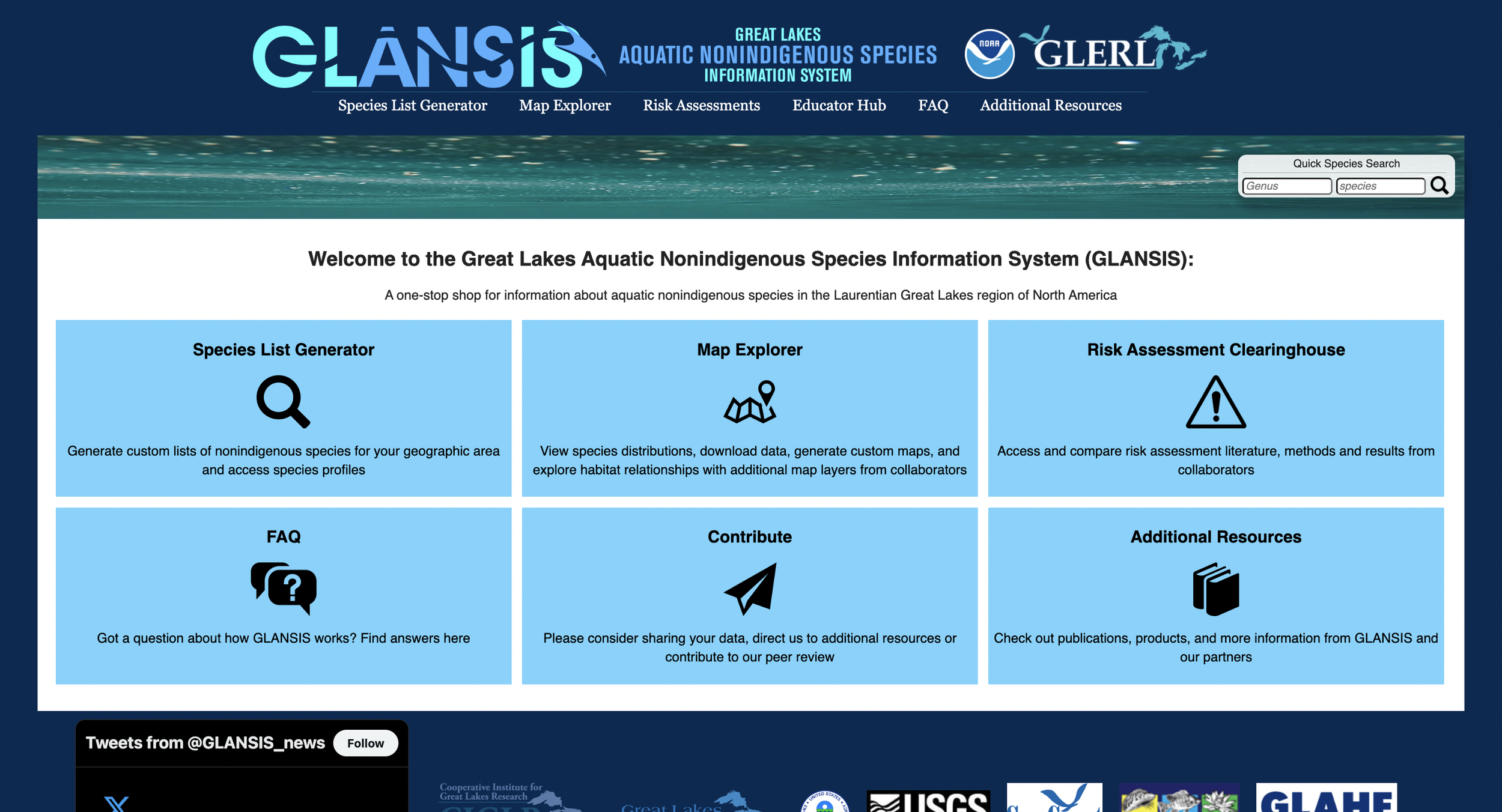
NOAA’s existing platform struggles to effectively serve its diverse audience, leading to user frustration and difficulties in accessing essential information on invasive species.
The website’s navigation, responsiveness, and data organization lack intuitiveness, preventing users from obtaining tailored resources and tools to address issues related to invasive species.
To improve clarity and usability, the overall redesign will focus on streamlining information display, enhancing user flow, and accommodating varied user needs. This will be achieved through three core design changes: Home Page Knowledge, Group Explore Discoverability, and Profile Information Layout.

Context
KEY USERS
Based on conversations with the client, we narrowed the audience to 3 key user groups:
Researchers🥼
Use: Access profiles of specific species, including data & academic archives for the species
Teachers & Students 📚
Use: Use: Generate lists of species based on self-selected criteria
RESEARCH ON EXISTING SITE
As the site currently exists, the users and client are having these key issues...
Differentiating Mobile and Web Experiences: The existing website does not follow a mobile-first approach, and many experiences are inaccessible in the mobile view.
Varying Scientific Understandings: The users of this system have varying understandings of scientific terminology, but the current site has a high barrier to entry, as it overloads the user with dense scientific data.
Outdated Design Systems: The site has not been updated visually since the early 2000s, with no existing design system to establish consistency throughout the site.
Field Managers 🎣
Use: Access profiles of specific species, including data & academic archives for the species
Initial Ideas & Sketches
I began my design process with low-fidelity wireframes on Figma to focus on the general organization and primary functionalities and layout of each page. As I cycled through various iterations of low-fidelity to high-fidelity wireframes, I kept my main goal in mind: to create a intuitive, organized, and collaborative environment for researchers and managers alike.
First round of low-fidelity prototype addressed usability issues
Each design iteration was followed by peer feedback to evaluate the usability, aesthetics, and overall system design.
Usability Testing
Usability testing identified flow issues: multiple journey challenges, heuristic evaluations, complex discussion page UI and access
Solution
Three key design decisions to address user needs:
01.
Home Page Information
The Home Page redesign, as a primary goal, aims to efficiently deliver pertinent information about the website offerings, GLANSIS's history, and the site's impact to both new and existing users.
02.
Discovering Through Group Species
The Group Explore Discoverability is designed to leverage affordances such as illustrative depictions and predictive search functions, thereby facilitating users in recognizing, rather than recalling, species names.
03.
Profile Information Reorganization
The reorganization of the profile information aims to alleviate information overload and enhance the mental model for seamless page navigation.


