Role
UX Designer
Timeline
September - December 2024
Teammates
Abby Lee, Claire Callen, Kimi Lillios, Melissa Wang & Yuyu Yang
Tools
FIGMA, FIGJAM, Adobe Illustrator
Green Swap — a mobile app designed to connect growers
Many home gardeners and small-scale farmers in urban and suburban areas struggle with surplus produce, leading to waste. In the U.S., 60% of the 1.02 billion tons of food waste comes from households. Meanwhile, many communities lack access to affordable fresh produce, hindering local resource sharing and sustainable food practices.
Our Solution
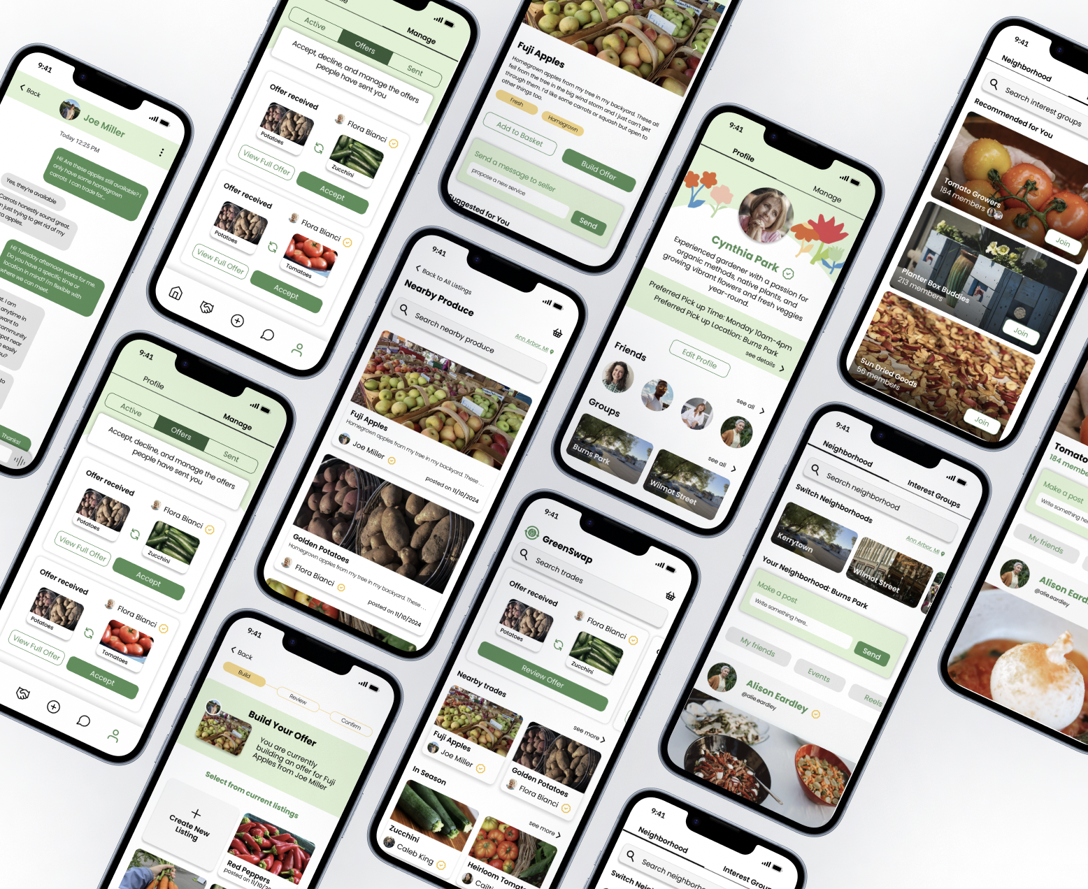
Green Swap is an online marketplace and community platform that facilitates the exchange of extra crops. It helps individuals reduce crop waste, adopt sustainable practices, and empowers users to make environmentally conscious decisions within the community.
01
Users Facilitating Trades🌾
Encouraging resource sharing and sustainability by promoting a sharing economy and efficient use of resources
Simplifying trade discovery with detailed listings, clear descriptions, and categories
Ensuring user-friendly transactions with intuitive tools and a seamless process
02
Engaging with Neighborhood Community👥
Fostering local connections and community building
Encouraging collaboration through shared passions and collective action
03
Personalized Experience Through Profile Settings🧍
Tailoring trade preferences to match individual needs and interests
Showcasing user profiles with trade history and reviews for better connections
Enabling users to manage visibility and customize interactions within the platform
Gathering Research
Our team initially set out to tackle the issue of food waste caused by the rejection of 'ugly' produce—fresh, perfectly edible fruits and vegetables discarded due to minor cosmetic imperfections. The original vision for GreenSwap was to create a platform that would connect consumers directly with local farmers and gardeners, helping reduce waste by giving imperfect produce a second chance.
Initial Design Statment
Competitive Analysis
Insights from Competitive Analysis:
Existing platforms addressed food waste but lacked community-oriented features.
Identified a gap for a platform that combines produce redistribution with fostering local connections and collaboration.
Key Design Lessons Learned:
Importance of supporting dual roles (buyers and sellers) with seamless transitions.
Trust-building mechanisms, such as rating systems, are critical for accountability.
Familiar concepts, such as marketplaces or community hubs, should be adapted digitally to feel intuitive and relatable.
Emphasizing sustainability and reducing waste appeals to eco-conscious users and strengthens the platform’s value proposition.
Personalization features, like favoriting and tailored recommendations, enhance user satisfaction and engagement.
Transition and Evolution:
Broadened the scope to include trading surplus goods beyond just 'ugly' produce
User Research
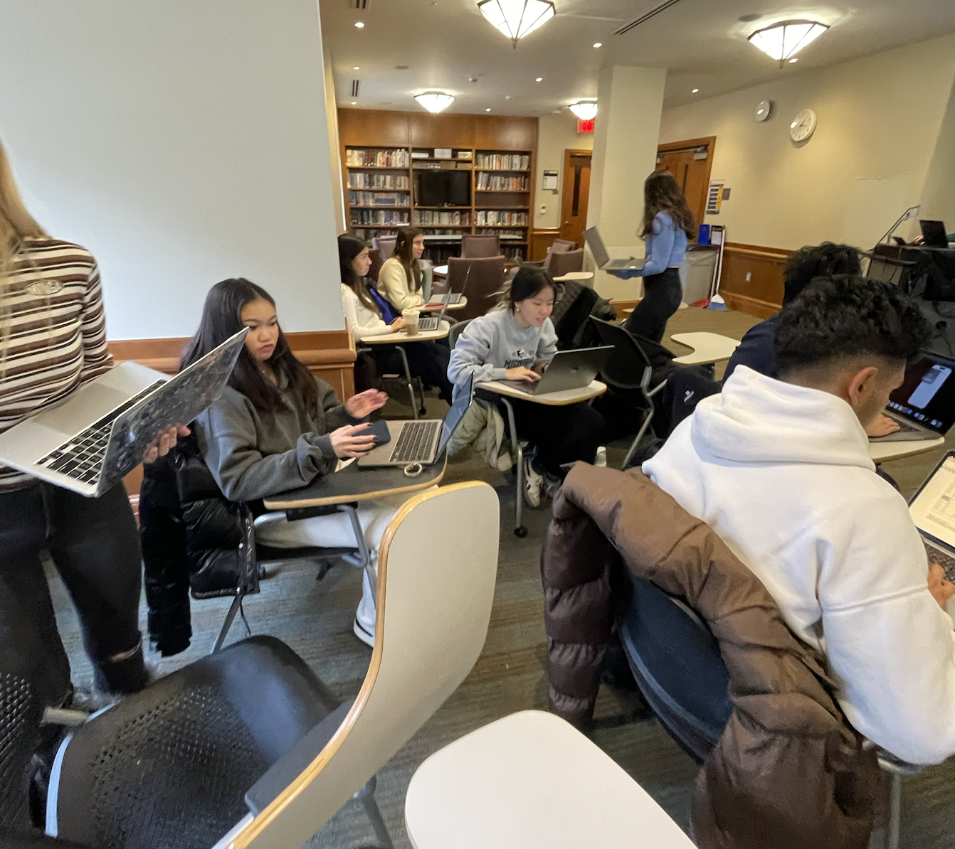
We conducted surveys, 14 in-depth in-person interviews, and 4 contextual inquiries with participants aged 21–56. Our diverse sample included individuals of various genders, regions, and professional backgrounds, ranging from home gardeners and small-scale urban growers to experienced farmers.
Core Questions / Interview Topics
Producers
1. Background and demographic information
2. What motivations/challenges/needs do you face when selling [produce]?
3. How they currently sell produce and their challenges with these methods.
4. What are your thoughts on using online platforms to connect with buyers? Have you used one before?
5. Surplus and Waste Management questions
Consumers
1. Background and demographic information
2. Purchasing habits and evaluation process
3. What are some challenges you face when buying fresh produce?
4. Have you used online platforms to buy fresh produce before? What was your experience like?
Results
From the Producers-side we realized something big…
“Most seasons we don’t have enough [crops] as they usually all get picked from the Upick. If produce isn’t sold, then it's used for cider, or picked up from the ground for food for deers and horses.”
“The only ugly produce we only see are the plums that fall on the ground. We aren’t allowed to pick them up to sell.”
“We usually bring the produce that don’t sell to the local farmers market. There’s not much though.”
Through interviews with 4 local farms, we found that “ugly” produce is rarely an issue for small-scale farmers. In contrast, larger commercial farms often face significant waste due to strict cosmetic standards. This insight prompted us to rethink our approach, refocusing GreenSwap’s mission on addressing challenges unique to small-scale and home growers, such as surplus management, buyer accessibility, and operational inefficiencies.
From gathering more insights with home growers and consumers, we were able unveil three themes
Enabling Transparent Listings
Consumers desire clear and detailed product information, such as freshness, quantity, origin, and price. Producers, on the other hand, deal with overwhelming customer inquiries and lack efficient ways to communicate their stock and availability.
Facilitating the “Farm Stand” Experience Digitally
Consumers expressed a love for the personal, informative experience of buying directly from farmers, including the opportunity to ask questions, receive recommendations, and learn about what’s in season.
Sustainable Surplus Redistribution for Home Growers
Home growers often struggle to manage surplus produce, leading to waste despite the crops being perfectly edible.
Ideation
User Persona
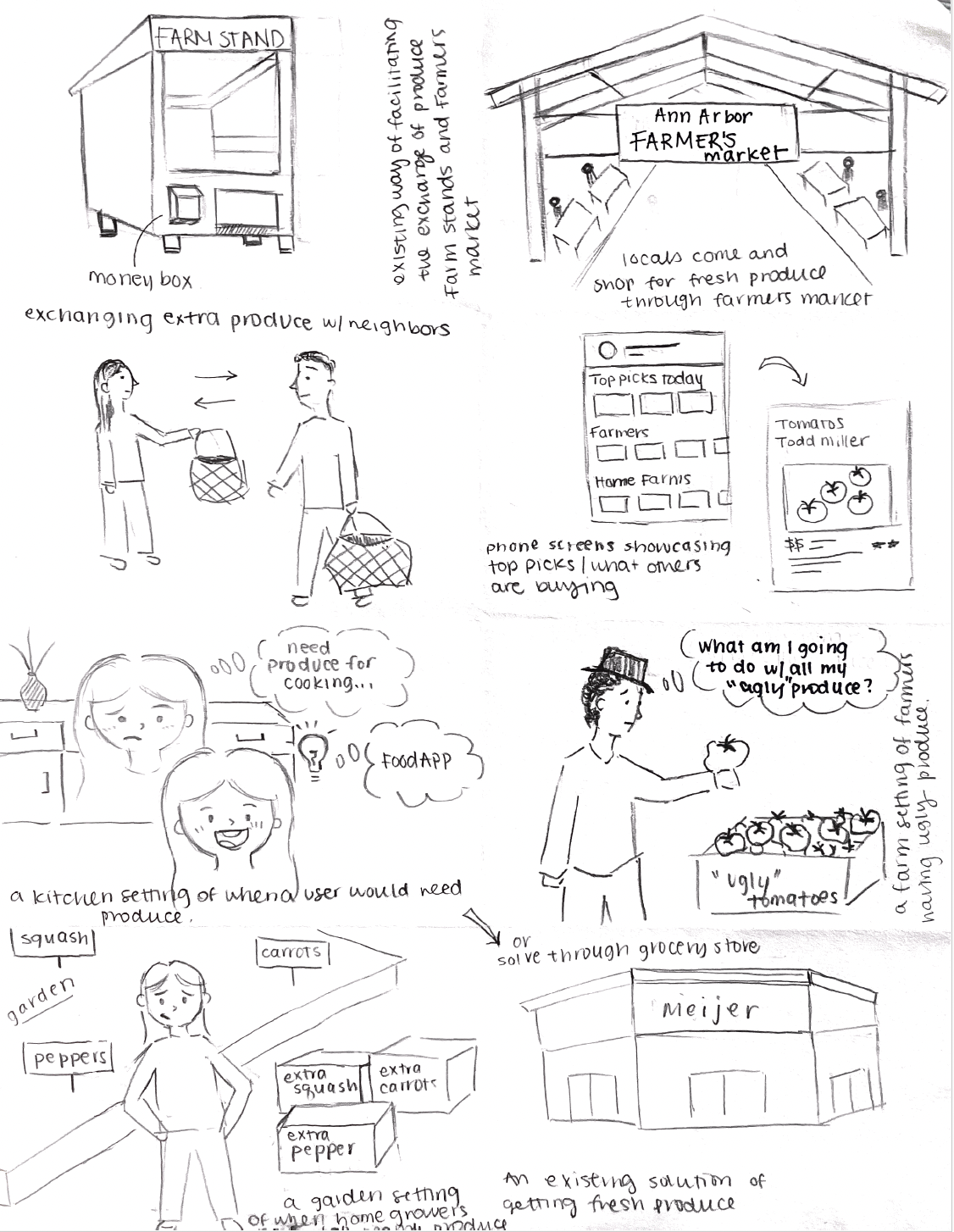
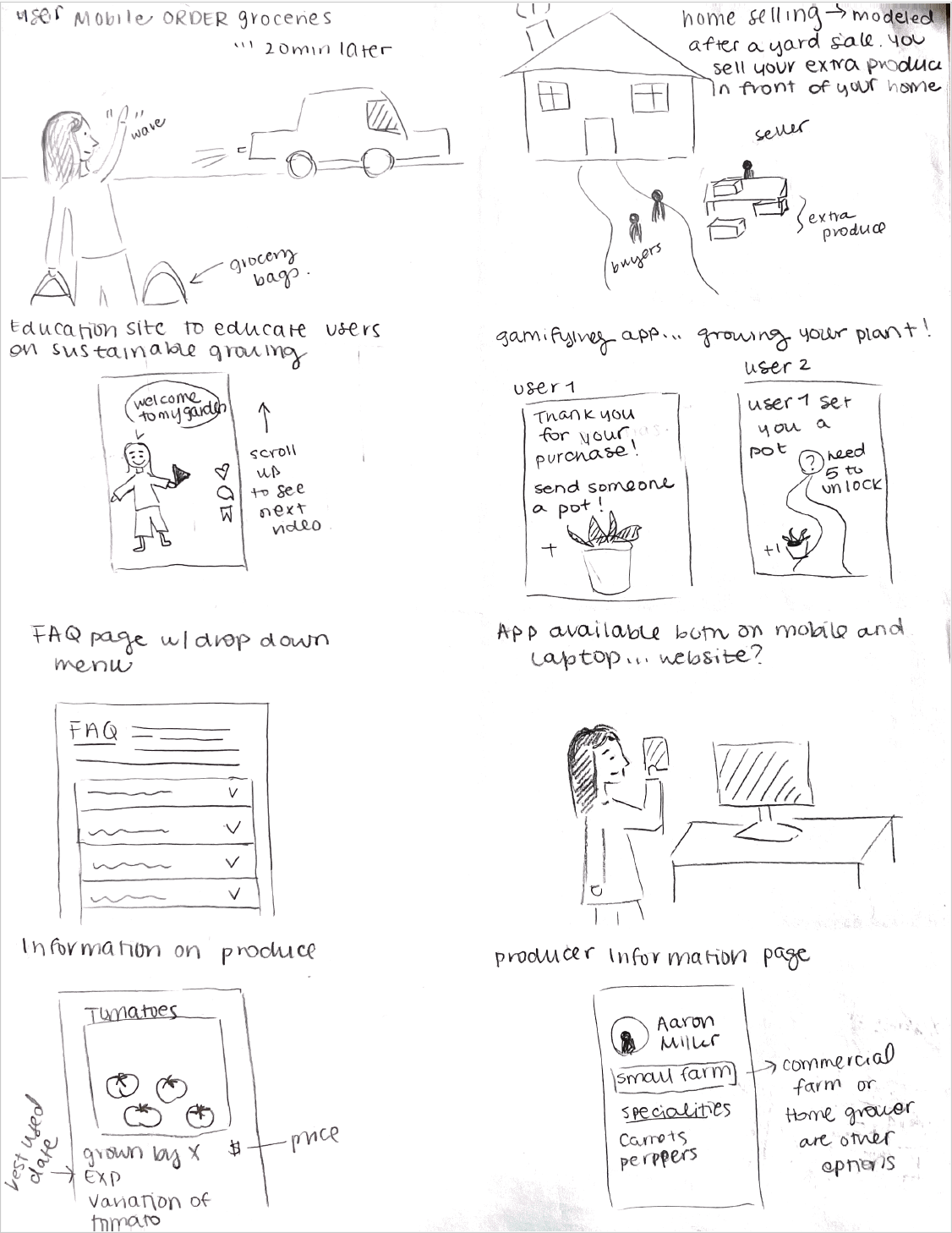
Design Sketches
Sketches were done to begin visualizing our mobile solution features with users needs in mind


Our Design Process
User Flow was created to organize the structure of the mobile app that will guide users in navigating to reach their end goal of trading produce and in presenting content
User Flow
Our approaches to design iterations
Whiteboarding was a critical tool in shaping our design decisions for Greenswap, particularly in refining the trade process. During the initial stages, the whiteboarding sessions provided a collaborative space to visualize and explore different user interaction flows.
White Boarding
Design Critique
Design critiques provided actionable feedback that highlighted usability issues, identified areas for improvement, and helped refine key features to better align with user needs. These sessions offered a collaborative space for iterative problem-solving, allowing us to gain valuable insights, outline clear next steps, and explore potential enhancements. Engaging directly with participants not only strengthened our understanding of user pain points but also inspired new ideas for design features that enriched the overall user experience.
Usability Testing
The evolution of our community page was guided by a user interview approach, which effectively identified pain points that slowed or hindered task completion. For example, users struggled to find how to change groups and differentiate “groups” from “community,” as confirmed by their feedback during interviews.
Iterations & major improvements
Through 4 rounds of in-class design critiques and 2 rounds of usability testing, we conducted multiple design iterations, leading to four major improvements. These iterations allowed us to refine our approach and enhance the overall user experience.
01. Better Streamlining of the Trade Process
Initial design had a confusing layout for product information, making it difficult for users to navigate. The dropdown menu for trading with existing listings or creating a new one was too hidden and unintuitive based on user feedback.
Improvements:
"Bundle trades" for exchanging multiple items simultaneously.
Introduced a card-based design where each card represented an existing listing.
Allowing the option to create a new listing.
Displayed all options visually at a glance.
Initial:
Redesign of Produce Listings & Information
Redesign of the Trading Process
02. Combining Events & Community Pages
Initial design had separate pages for events and communities led to overlapping features, creating confusion between event-specific and community-specific settings.
Improvements:
Unified page structure to display both community details and associated events seamlessly.
Event creation from community pages to streamline the process for users.
Filters for events within communities, such as location or category-based filters.
Initial:
03. Be more adaptable for ways to connect with others
Initial design focused on location-based communities, limiting user flexibility and diversity of interests. User feedback highlighted the need for more adaptable ways to connect with others.
Improvements:
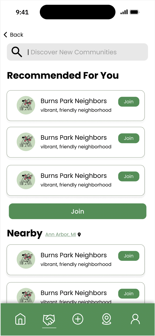
Redesigned the community page to include two group types:
Neighborhoods: Automatically assigned based on user location for local connections.
Interest Groups: Open for users to join based on shared topics, allowing broader connections.
Initial:
Onboarding allows users to join neighborhood groups
Events can be posted in the communities page
The initial design prioritized functionality over aesthetics, resulting in poor visual cohesion and misalignment with users' mental models. This disconnect made it harder for users to understand and navigate the features effectively.
Improvements:
Redesigned with a cohesive style guide
Implemented a card-based layout to align with trading cards model
Added more interactive prototype actions
04. More cohesive design look
The Final Screens
The complete app featuring onboarding, trade listings, community and profile pages!
Reflections
Restarting Could Be A Good Thing
When we realized that our initial high-fidelity prototype was not receiving the positive feedback we had anticipated, it became clear that we needed to go back to the drawing board—literally. While the idea of restarting from the low-fidelity prototype was initially daunting, it was a necessary step to better understand why users were struggling with the design.
Balancing Big Ideas with User Needs
We were so excited about the potential of our app—it felt like we were entering a niche, untapped market full of opportunities for growth and creativity. The possibilities seemed limitless, and as a team we had out-of-the-box ideas. For example, a virtual reality feature for a community garden, which can increase users’ interactions with community pages.
Instead of pursuing every idea, we shifted our focus to addressing users' pain points and delivering solutions that truly met their needs. This didn’t mean we stopped being creative—it just meant channeling that creativity into features that provided real value.
Thank you for reading! Hope you’re having an amazing day😊


